Onboarding with care: Designing a seamless first experience
Context
Gramaze provides professional healthcare and wellness services at home, ranging from nursing and physiotherapy to mental health therapy, nutrition, palliative, and hospice care. To make these services more accessible, Gramaze is building a digital platform where individuals can apply for care for themselves or loved ones. My role as a product designer was to craft an onboarding experience that reduces friction, enhances trust, and drives customer retention.
Problem
Assessing a patient’s condition is often hectic, with long queues and manual processes that frustrate both patients and medical staff. Gramaze needed a way to ease this workload while still equipping caregivers with the information required for holistic care. While in-person assessments remain essential, the challenge was to design an onboarding flow that streamlines data collection, reduces friction, and speeds up consultations.
Guided by early research, I focused on clarity, simplicity, and user confidence resulting in a step-by-step experience that feels intuitive, effortless, and trustworthy.
Goals
01
Enhance the patient journey
Reduce friction, waiting times, and make onboarding seamless.
02
Support the medical team
Provide quality pre-assessment data to simplify and speed up consultations.
03
Build for growth
Design an MVP that scales, delights users, and strengthens trust and retention.
Team
I collaborated closely with a Principal designer and a project manager from exploration to handoff, holding regular check-ins to iterate quickly and stay aligned with the product vision. This constant feedback loop ensured we built an onboarding experience that was both usable and impactful.
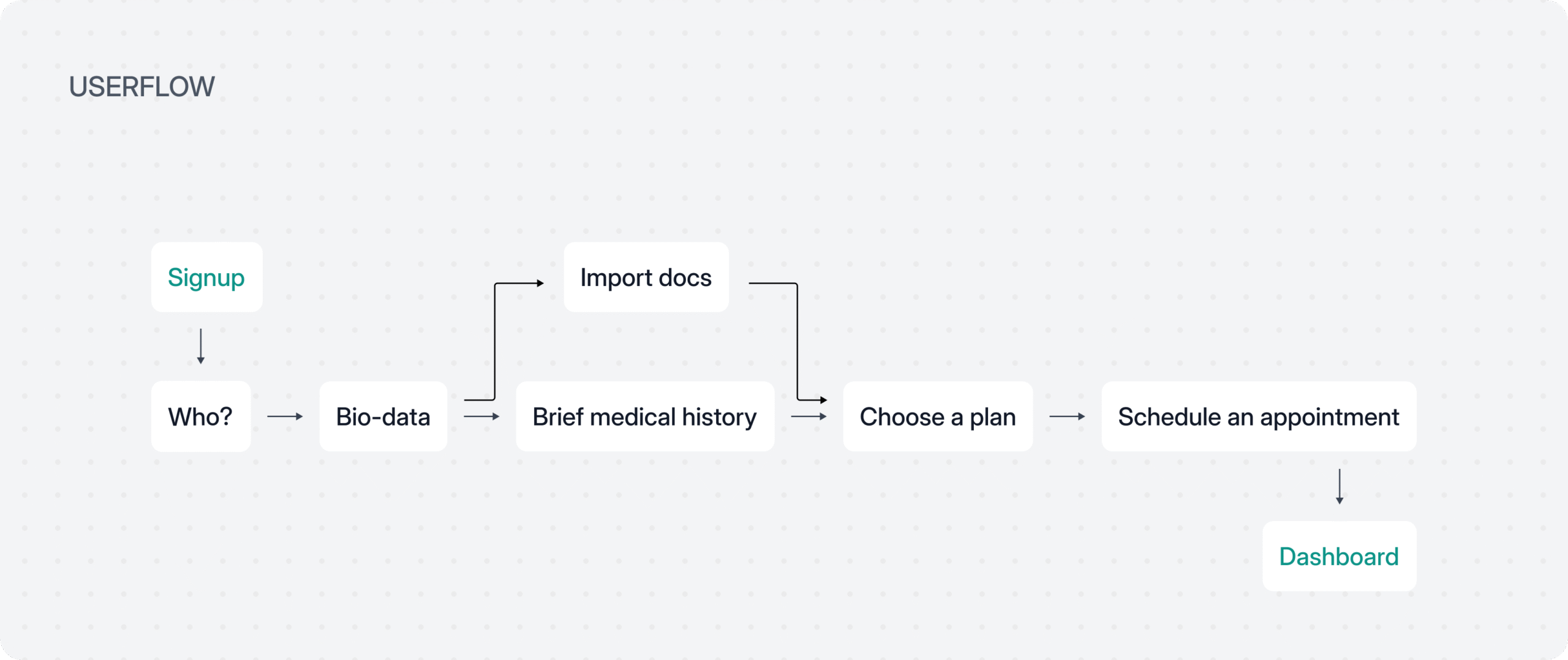
Exploring early concepts
In the early stages, I explored multiple layout directions to strike the right balance between clarity, hierarchy, and visual appeal. We tested variations in structure, spacing, and interaction patterns to make the onboarding feel modern, approachable, and easy to follow. These explorations formed the foundation for a clean, intuitive experience.
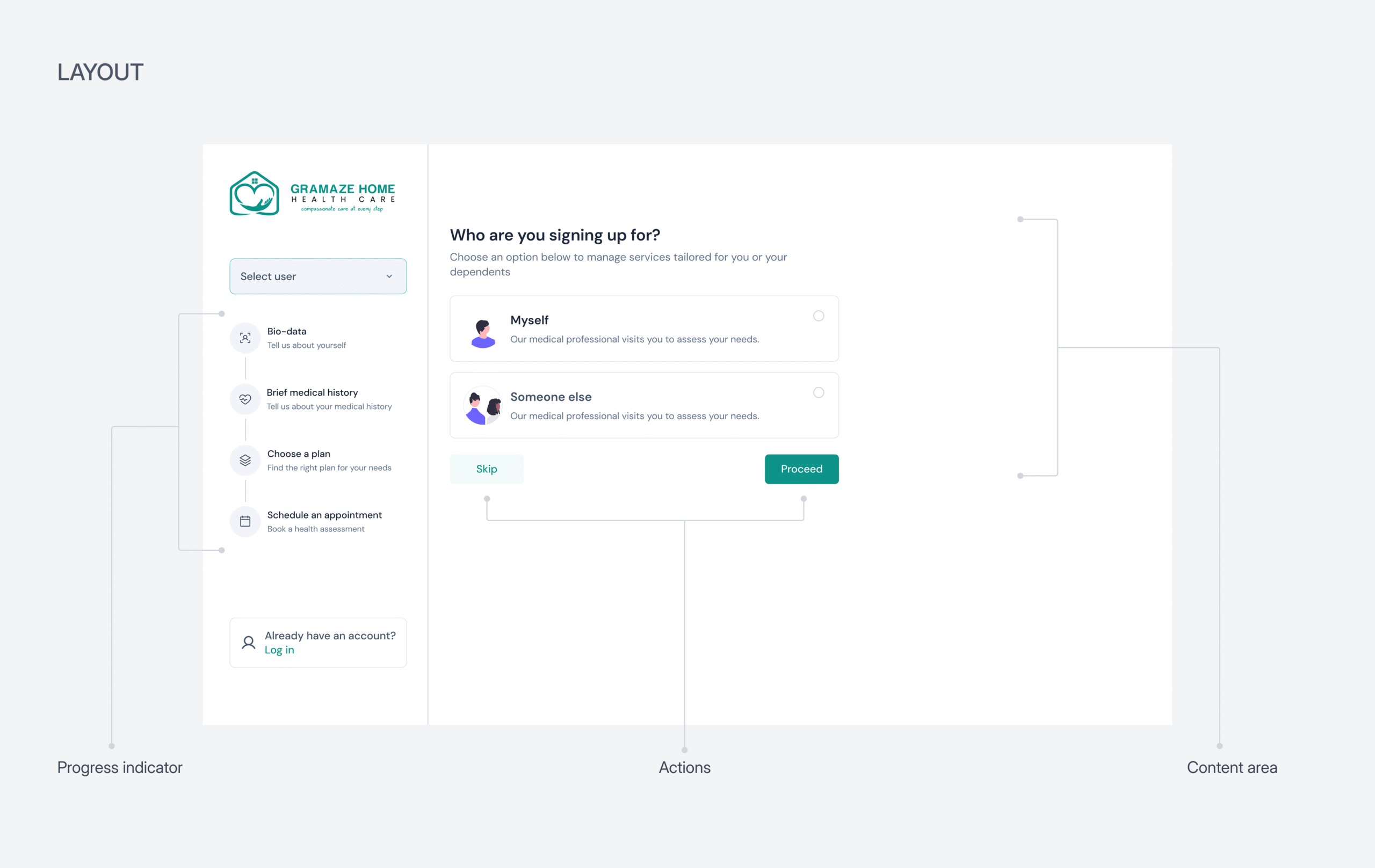
From the explorations, we narrowed down to a layout that prioritizes clarity and ease of use. A stepper on the left gives users a clear sense of progress, while the main content area highlights minimal input fields to reduce cognitive load. Every detail was intentionally designed to keep the experience smooth, focused, and effortless.
Effortless signup
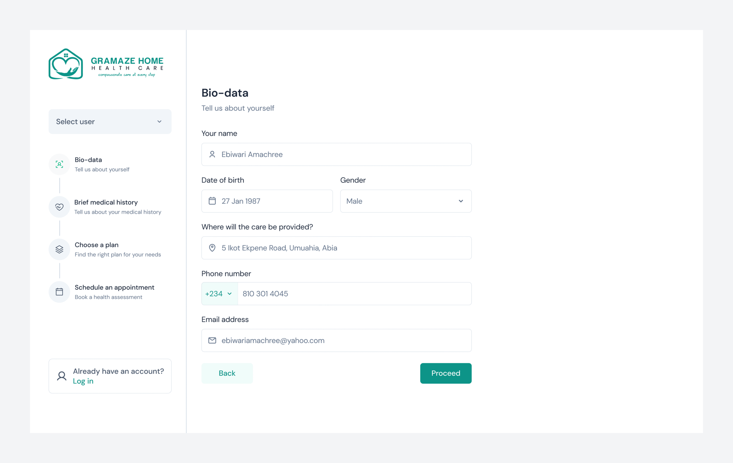
The onboarding was designed to support both individuals seeking care for themselves and those booking on behalf of someone else. Presenting these options clearly at the start ensures users are guided into the right flow. In this case, the user journey focuses on the “Myself” path.
Once selected, the onboarding collects just enough information to create a patient profile and give the medical team a clear understanding of their needs. The form was intentionally simplified to minimize cognitive load and keep the process effortless.
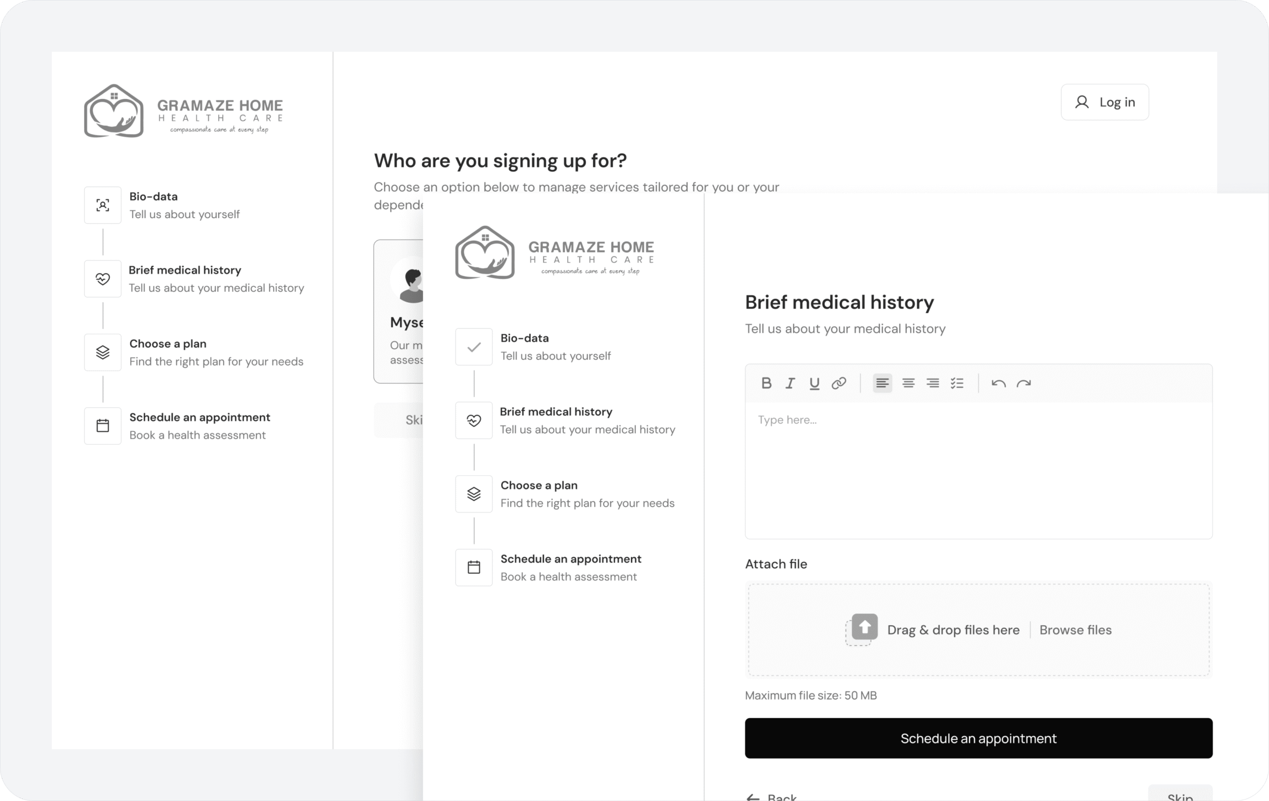
Simplifying the information sharing process
To deliver holistic care and better understand patients, Gramaze requires access to users’ medical history. To make this process simple and flexible, I designed two options: users can either upload a medical report directly from a healthcare facility or type in the details themselves. To further reduce effort, a voice-to-text feature was integrated, allowing users to share information quickly and comfortably.
Guiding choices through visual cues
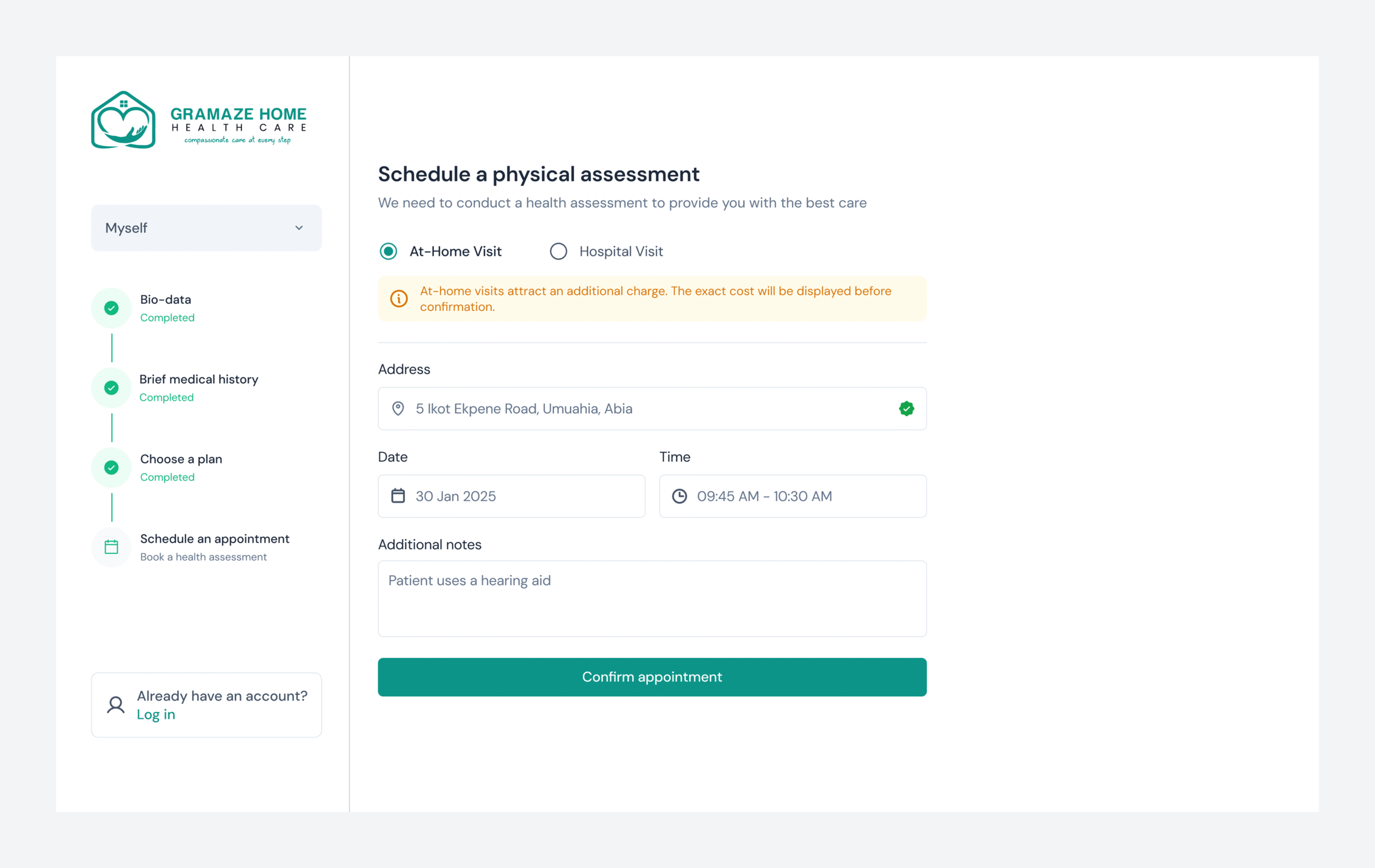
The final step of onboarding is scheduling an appointment, where the medical team can assess patients either physically or virtually. To make this choice clearer and more engaging, we introduced illustrations that visually represent each option. These cues guide users in selecting what’s most convenient for them, ultimately making the experience more intuitive and reassuring.
Handling feedbacks with clarity
I designed intuitive and reassuring feedback alerts to guide users through key actions in the flow. Clear, timely messages help users understand what’s happening at each step, reducing confusion and ensuring a smoother onboarding experience.
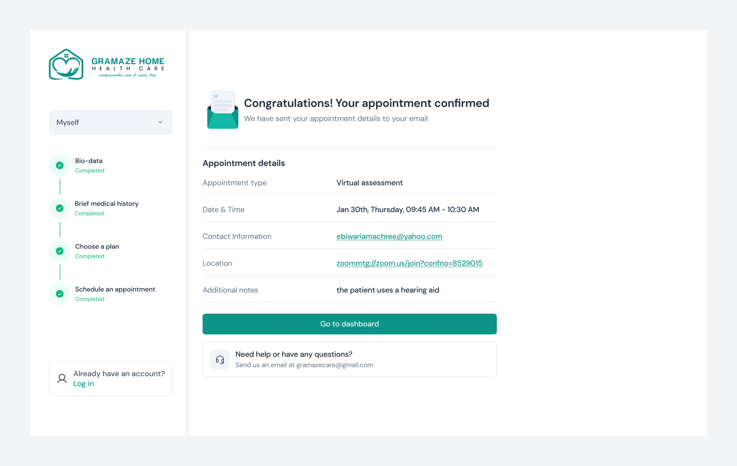
At the end of onboarding, users are welcomed with a congratulatory page that includes a brief summary of their appointment details and clear instructions on next steps. This final touchpoint was intentionally designed to reassure patients, reinforce clarity, and establish trust from the very first interaction.
Key takeaways
Flexibility improves accessibility
Giving users options (e.g., uploading reports, typing, or voice-to-text) makes information sharing inclusive and less stressful.
Visual and functional cues matter
Elements like progress steppers, illustrations, and clear feedback alerts keep users engaged and confident.